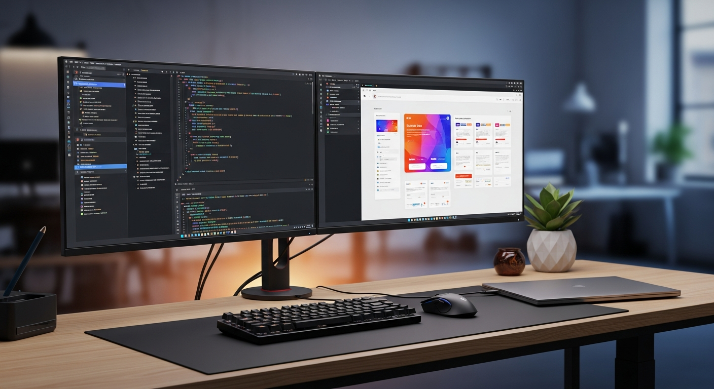
Claude Code और Radix UI से accessible React UI बनाना
Claude Code और Radix UI से Dialog, Dropdown और Tabs बनाएं: install commands, React examples, styling, pitfalls और checklist.

React में modal, dropdown और tabs बनाना शुरू में आसान लगता है। असली मुश्किल तब आती है जब UI को keyboard से चलाते हैं। Focus dialog में जाता है या नहीं, Escape close करता है या नहीं, screen reader title पढ़ता है या नहीं, close के बाद focus वापस trigger button पर आता है या नहीं, ये सब manual implementation में अक्सर छूट जाता है।
Radix UI इसी समस्या के लिए अच्छा आधार देता है। यह ready-made visual design नहीं देता, बल्कि unstyled primitives देता है। मतलब रंग, spacing और typography आपके project के रहेंगे, लेकिन Dialog, Dropdown Menu और Tabs का behavior Radix संभालेगा। Claude Code के साथ यह approach ज्यादा safe है, क्योंकि agent को modal behavior invent करने के बजाय existing primitive assemble करने होते हैं।
इस guide में हम Claude Code और Radix UI से accessible React UI बनाने का practical workflow देखेंगे: install commands, prompt, copy-paste TypeScript example, CSS notes, 3 use cases, common pitfalls, official links और monetization CTA। Radix पर बनी higher-level library चाहिए तो Claude Code shadcn/ui guide पढ़ें। Accessibility review के लिए Claude Code accessibility guide भी useful है।
Claude Code के लिए Radix UI क्यों सही है
Radix official docs Primitives को low-level component library कहते हैं जो accessibility, customization और developer experience पर focus करती है। इसका मतलब है कि Radix आपके design को replace नहीं करता। यह roles, focus management, keyboard interaction और component structure देता है।
Radix Dialog modal और non-modal mode support करता है, modal में focus trap करता है, Escape से close हो सकता है, और Title तथा Description से screen reader announcements बेहतर बनाता है। Tabs WAI-ARIA tabs pattern follow करता है और arrow keys, Home, End handle करता है। Dropdown Menu labels, separators और radio items देता है।
Claude Code context पढ़ता है, edit करता है और result verify करता है। अगर आप उसे सिर्फ div से custom modal बनाने को कहेंगे तो diff बड़ा होगा और review मुश्किल होगा। अगर आप Radix UI specify करेंगे तो Claude Code state, API, CSS classes, analytics events और tests पर focus कर सकता है।
flowchart LR
  A["Claude Code को UI requirement दें"] --> B["Behavior के लिए Radix UI use करें"]
  B --> C["React state और product logic जोड़ें"]
  C --> D["Project CSS या tokens apply करें"]
  D --> E["Keyboard, screen reader और mobile check करें"]
Install commands
Radix docs में combined radix-ui package भी है, लेकिन कई React projects individual packages use करते हैं। इस article के examples individual packages पर हैं ताकि package.json में dependencies साफ दिखें।
npm install @radix-ui/react-dialog @radix-ui/react-dropdown-menu @radix-ui/react-tabs
pnpm use करते हैं तो:
pnpm add @radix-ui/react-dialog @radix-ui/react-dropdown-menu @radix-ui/react-tabs
Claude Code install नहीं है तो official docs देखें। npm installation:
npm install -g @anthropic-ai/claude-code
Team environment में install से पहले permissions, update policy, allowed commands और review ownership तय करें। Agent fast है, लेकिन production UI का जिम्मा फिर भी team का है।
Claude Code prompt
Prompt में सिर्फ visual request न लिखें। Interaction rules साफ लिखें।
claude "Existing React + TypeScript screen में confirmation Dialog, user Dropdown Menu और settings Tabs जोड़ें।
Requirements:
- @radix-ui/react-dialog, @radix-ui/react-dropdown-menu और @radix-ui/react-tabs use करें
- Dialog.Title और Dialog.Description रखें
- icon-only close button पर aria-label जोड़ें
- focus style न हटाएं; :focus-visible use करें
- existing design tokens मिलें तो use करें
- अंत में keyboard, mobile, typecheck और accessibility checks बताएं"
Output के बाद screenshot पर भरोसा न करें। Diff देखें। asChild से nested button तो नहीं बना, Dialog.Title delete तो नहीं हुआ, CSS ने focus invisible तो नहीं किया।
Copy-paste React example
यह example confirmation dialog, user menu और settings tabs को एक file में दिखाता है। Vite, React SPA या Next.js Client Component में काम करेगा। Next.js App Router में ऊपर "use client"; जोड़ें।
import * as React from "react";
import * as Dialog from "@radix-ui/react-dialog";
import * as DropdownMenu from "@radix-ui/react-dropdown-menu";
import * as Tabs from "@radix-ui/react-tabs";
import "./radix-accessible-demo.css";

type User = { name: string; email: string };

type ConfirmDialogProps = {
  open: boolean;
  onOpenChange: (open: boolean) => void;
  title: string;
  description: string;
  confirmLabel?: string;
  danger?: boolean;
  onConfirm: () => Promise<void> | void;
};

export function ConfirmDialog({
  open,
  onOpenChange,
  title,
  description,
  confirmLabel = "Confirm",
  danger = false,
  onConfirm,
}: ConfirmDialogProps) {
  const [pending, setPending] = React.useState(false);

  async function handleConfirm() {
    setPending(true);
    try {
      await onConfirm();
      onOpenChange(false);
    } finally {
      setPending(false);
    }
  }

  return (
    <Dialog.Root open={open} onOpenChange={onOpenChange}>
      <Dialog.Portal>
        <Dialog.Overlay className="radix-overlay" />
        <Dialog.Content className="radix-dialog">
          <Dialog.Title className="radix-dialog-title">{title}</Dialog.Title>
          <Dialog.Description className="radix-dialog-description">
            {description}
          </Dialog.Description>
          <div className="button-row">
            <Dialog.Close asChild>
              <button type="button" className="button secondary">Cancel</button>
            </Dialog.Close>
            <button
              type="button"
              className={`button ${danger ? "danger" : "primary"}`}
              disabled={pending}
              onClick={handleConfirm}
            >
              {pending ? "Working..." : confirmLabel}
            </button>
          </div>
          <Dialog.Close asChild>
            <button type="button" className="icon-button" aria-label="Close dialog">
              x
            </button>
          </Dialog.Close>
        </Dialog.Content>
      </Dialog.Portal>
    </Dialog.Root>
  );
}

export function UserMenu({
  user,
  onOpenProfile,
  onOpenBilling,
  onSignOut,
}: {
  user: User;
  onOpenProfile: () => void;
  onOpenBilling: () => void;
  onSignOut: () => void;
}) {
  const [theme, setTheme] = React.useState<"light" | "dark" | "system">("system");

  return (
    <DropdownMenu.Root>
      <DropdownMenu.Trigger asChild>
        <button type="button" className="user-trigger" aria-label={`${user.name} menu`}>
          <span className="avatar" aria-hidden="true">{user.name.slice(0, 1)}</span>
          <span>{user.name}</span>
        </button>
      </DropdownMenu.Trigger>
      <DropdownMenu.Portal>
        <DropdownMenu.Content className="dropdown-content" align="end" sideOffset={8}>
          <DropdownMenu.Label className="dropdown-label">{user.email}</DropdownMenu.Label>
          <DropdownMenu.Separator className="dropdown-separator" />
          <DropdownMenu.Item className="dropdown-item" onSelect={() => onOpenProfile()}>
            Profile
          </DropdownMenu.Item>
          <DropdownMenu.Item className="dropdown-item" onSelect={() => onOpenBilling()}>
            Billing
          </DropdownMenu.Item>
          <DropdownMenu.Separator className="dropdown-separator" />
          <DropdownMenu.RadioGroup
            value={theme}
            onValueChange={(value) => setTheme(value as "light" | "dark" | "system")}
          >
            <DropdownMenu.RadioItem className="dropdown-item" value="light">Light</DropdownMenu.RadioItem>
            <DropdownMenu.RadioItem className="dropdown-item" value="dark">Dark</DropdownMenu.RadioItem>
            <DropdownMenu.RadioItem className="dropdown-item" value="system">System</DropdownMenu.RadioItem>
          </DropdownMenu.RadioGroup>
          <DropdownMenu.Separator className="dropdown-separator" />
          <DropdownMenu.Item className="dropdown-item danger-text" onSelect={() => onSignOut()}>
            Sign out
          </DropdownMenu.Item>
        </DropdownMenu.Content>
      </DropdownMenu.Portal>
    </DropdownMenu.Root>
  );
}

export function SettingsTabs() {
  return (
    <Tabs.Root defaultValue="profile" className="tabs-root">
      <Tabs.List className="tabs-list" aria-label="Account settings">
        <Tabs.Trigger className="tabs-trigger" value="profile">Profile</Tabs.Trigger>
        <Tabs.Trigger className="tabs-trigger" value="security">Security</Tabs.Trigger>
        <Tabs.Trigger className="tabs-trigger" value="notifications">Notifications</Tabs.Trigger>
      </Tabs.List>
      <Tabs.Content className="tabs-content" value="profile">
        <label className="field">
          <span>Display name</span>
          <input defaultValue="Masa" />
        </label>
      </Tabs.Content>
      <Tabs.Content className="tabs-content" value="security">
        <p>Require two-factor authentication before changing billing settings.</p>
        <button type="button" className="button secondary">Review security</button>
      </Tabs.Content>
      <Tabs.Content className="tabs-content" value="notifications">
        <label className="check-row">
          <input type="checkbox" defaultChecked />
          <span>Email me when a project is exported.</span>
        </label>
      </Tabs.Content>
    </Tabs.Root>
  );
}
Styling notes
Radix UI unstyled है। आप Tailwind, CSS Modules या plain CSS use कर सकते हैं। Important बात: focus visible रहे, Dialog mobile पर overflow न करे और active states साफ दिखें।
.radix-overlay {
  position: fixed;
  inset: 0;
  background: rgba(15, 23, 42, 0.55);
}

.radix-dialog {
  position: fixed;
  left: 50%;
  top: 50%;
  width: min(calc(100vw - 32px), 480px);
  max-height: calc(100vh - 32px);
  overflow: auto;
  transform: translate(-50%, -50%);
  border-radius: 8px;
  background: white;
  box-shadow: 0 24px 80px rgba(15, 23, 42, 0.28);
  padding: 24px;
}

.button-row {
  display: flex;
  justify-content: flex-end;
  gap: 12px;
  margin-top: 24px;
}

.dropdown-content {
  min-width: 220px;
  border: 1px solid #e2e8f0;
  border-radius: 8px;
  background: white;
  box-shadow: 0 18px 50px rgba(15, 23, 42, 0.18);
  padding: 6px;
}

.dropdown-item[data-highlighted] {
  background: #eff6ff;
  color: #1d4ed8;
}

.tabs-trigger[data-state="active"] {
  border-color: #2563eb;
  color: #1d4ed8;
  font-weight: 700;
}

:focus-visible {
  outline: 3px solid #f59e0b;
  outline-offset: 2px;
}
3 practical use cases
| Use case | Radix UI क्यों मदद करता है | Claude Code क्या जोड़े |
|---|---|---|
| Delete या cancel confirmation | Focus, title और description reliable रहते हैं | API, pending state, errors, tests |
| Account menu | Keyboard navigation, separators, radio items | User data, logout, billing, analytics |
| Settings tabs | tablist, tab और panel relation सही रहता है | Forms, save behavior, URL sync |
पहला use case SaaS admin screen है। Project delete, subscription cancel या permission change में clear warning जरूरी है। Radix Dialog behavior संभालता है और Claude Code business logic जोड़ता है।
दूसरा use case course या membership site है। Account menu में profile, downloads, purchase history और logout आते हैं। Click-only menu keyboard users को रोक देता है।
तीसरा use case settings page है। Profile, security और notifications को tabs में रखना आसान है, लेकिन save responsibility clear होनी चाहिए। Claude Code prompt में यह requirement लिखें।
Common pitfalls
Dialog.Title को सिर्फ design के कारण delete न करें। Title visible न हो तो भी screen reader के लिए label चाहिए। MDN dialog role docs भी सही label और focus management की जरूरत बताते हैं।
Focus outline hide न करें। Brand style से replace करना ठीक है, invisible बनाना ठीक नहीं।
asChild check करें। अगर button के अंदर button बन गया तो HTML invalid होगा।
Multiple modals stack करने से बचें। WAI-ARIA Modal Dialog Pattern focus को dialog में ले जाने और close के बाद trigger पर लौटाने की बात करता है।
Mobile जरूर check करें। Fixed 600px Dialog, right side से कटता menu या लंबा tab label real users के लिए problem बन सकता है।
Official links और checks
- Radix Primitives Introduction
- Radix Dialog docs
- Radix Dropdown Menu docs
- Radix Tabs docs
- WAI-ARIA Modal Dialog Pattern
- MDN dialog role
- Claude Code getting started
Publish से पहले keyboard-only open/close, Escape, focus return, Dropdown arrow keys, Tabs arrow keys और mobile overflow जरूर check करें।
Monetization CTA
यह topic service CTA के लिए अच्छा है क्योंकि reader के पास अक्सर real project होता है। Natural offer है: “अपने repository की UI को accessible और reviewable बनाएं.”
ClaudeCodeLab की Claude Code training और consultation में CLAUDE.md, component rules, accessibility checks, review prompts और verification scripts real repository के हिसाब से design किए जा सकते हैं। Solo developer checklist और templates से शुरू कर सकता है; team को actual screen review से ज्यादा value मिलेगी।
Tested result
Masa के test React screen में hand-written modal को Radix Dialog से replace किया गया और menu तथा tabs भी Radix पर लाए गए। Code थोड़ा बढ़ा, लेकिन review criteria साफ हो गए। Claude Code से focus return, screen reader name, mobile width और keyboard behavior review करवाने पर visual polish से ज्यादा useful feedback मिला। निष्कर्ष: Radix UI accessibility सोचने का replacement नहीं है; यह Claude Code को safe behavior foundation देता है।
मुफ़्त PDF: Claude Code cheatsheet
Email डालें और commands, review habits तथा safe workflow वाली एक-page PDF पाएँ.
हम आपका data सुरक्षित रखते हैं और spam नहीं भेजते.

लेखक के बारे में
Masa
Claude Code workflow और team adoption पर काम करने वाला engineer.
संबंधित लेख
Claude Code Obsidian to CLAUDE.md workflow: context बार-बार न समझाएं
Obsidian notes को CLAUDE.md operating notes में बदलकर Claude Code sessions को resume करना आसान बनाएं.

Claude Code Revenue CTA Routing: article से PDF, Gumroad और consultation तक
Reader intent के आधार पर free PDF, Gumroad products और consultation तक CTA route करने वाला workflow.

Claude Code टीम हैंडऑफ नियम: review proof, permissions, rollback और revenue path
Claude Code टीम काम के लिए evidence, permission rules, rollback, free PDF, Gumroad और consultation path वाला handoff.