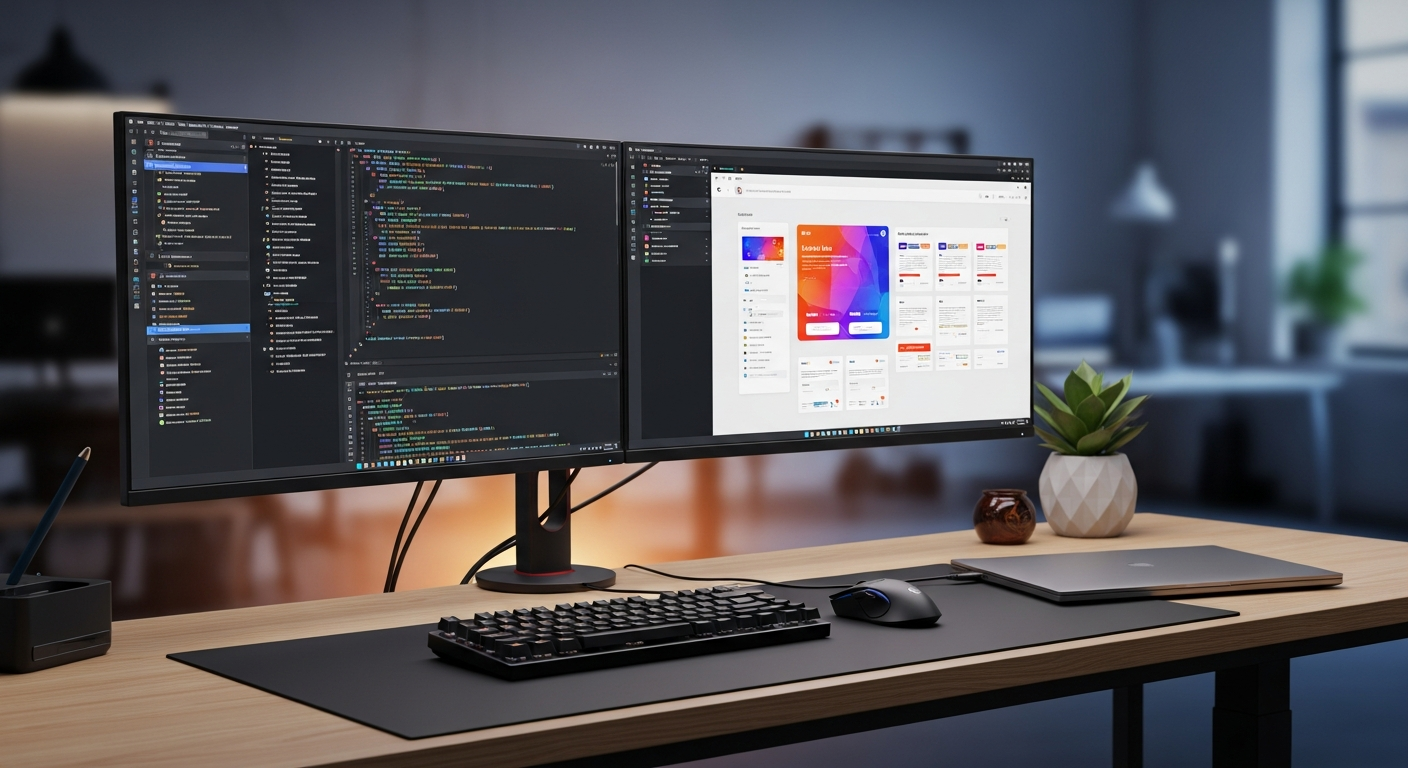
Build Accessible React UI with Claude Code and Radix UI
Build accessible React dialogs, dropdowns, and tabs with Radix UI and Claude Code, including install steps, code, pitfalls, and checks.

When React teams build dialogs, dropdown menus, or tabs from scratch, the hard part is rarely the rounded corner. The hard part is keyboard navigation, focus return, screen reader naming, escape behavior, and responsive layout. A component can look finished with a mouse and still fail for a keyboard user.
Radix UI is useful because it gives you unstyled primitives with strong behavior. You keep control of the visual design, but Radix handles much of the interaction contract for patterns such as Dialog, Dropdown Menu, and Tabs. Claude Code becomes much more reliable when you ask it to assemble these primitives instead of inventing modal behavior by hand.
This guide shows a practical workflow for using Claude Code with Radix UI: install commands, a prompt you can paste into Claude Code, copy-pasteable React and TypeScript examples, CSS notes, three use cases, common pitfalls, official links, and a monetization CTA. If you want a higher-level component system on top of Radix, read the Claude Code shadcn/ui guide. For broader accessibility review, pair this with the Claude Code accessibility implementation guide.
Why Radix UI Fits Claude Code
Radix Primitives are described in the official docs as a low-level component library focused on accessibility, customization, and developer experience. That means Radix is not trying to own your visual brand. It gives you the behavioral layer: roles, focus management, keyboard interaction, and component anatomy.
For example, Radix Dialog supports modal and non-modal modes, traps focus in modal mode, can close with Escape, and uses Title and Description for screen reader announcements. Radix Tabs follows the WAI-ARIA tabs pattern and handles arrow keys, Home, and End. Dropdown Menu gives you labeled groups, separators, radio items, and submenus without writing the entire roving focus system yourself.
Claude Code works through an agent loop: gather context, edit, verify, and adjust. If you ask it to create a dialog from bare div elements, it has to design the accessibility behavior and the visual layer at the same time. If you specify Radix UI, Claude Code can focus on the codebase-specific work: state, API calls, styling hooks, analytics, and tests.
flowchart LR
  A["Describe UI requirements to Claude Code"] --> B["Use Radix UI for behavior"]
  B --> C["Connect React state and product logic"]
  C --> D["Apply project CSS or tokens"]
  D --> E["Verify keyboard, screen reader, and mobile behavior"]
Install The Packages
The current Radix documentation also presents the combined radix-ui package, but many React projects still use individual packages such as @radix-ui/react-dialog. The examples below use individual packages because they make the imported primitives explicit in package.json.
npm install @radix-ui/react-dialog @radix-ui/react-dropdown-menu @radix-ui/react-tabs
With pnpm:
pnpm add @radix-ui/react-dialog @radix-ui/react-dropdown-menu @radix-ui/react-tabs
If Claude Code is not installed yet, check the official Claude Code docs for the latest platform guidance. The npm install path is:
npm install -g @anthropic-ai/claude-code
Avoid treating global installation as a small detail in a company environment. Decide how updates, permissions, and verification work before putting Claude Code into a team workflow.
A Better Claude Code Prompt
Do not ask Claude Code for “a nice modal.” Ask for the interaction contract. A good prompt gives the agent a smaller and more reviewable target.
claude "Add a confirmation Dialog, user Dropdown Menu, and settings Tabs to the existing React + TypeScript screen.
Requirements:
- Use @radix-ui/react-dialog, @radix-ui/react-dropdown-menu, and @radix-ui/react-tabs
- Keep Dialog.Title and Dialog.Description
- Add aria-label to icon-only close buttons
- Do not remove visible focus styles; use :focus-visible
- Match existing design tokens where available
- After editing, list keyboard, mobile, typecheck, and accessibility checks"
After Claude Code edits, review the diff. Check that asChild did not create nested buttons, that Dialog.Title was not removed for visual reasons, and that CSS did not hide focus outlines without replacing them.
Copy-Paste React Example
The following example includes a confirmation dialog, a user menu, and settings tabs. It works in a normal React SPA, Vite app, or a Next.js Client Component. In the Next.js App Router, add "use client"; at the top of the file.
import * as React from "react";
import * as Dialog from "@radix-ui/react-dialog";
import * as DropdownMenu from "@radix-ui/react-dropdown-menu";
import * as Tabs from "@radix-ui/react-tabs";
import "./radix-accessible-demo.css";

type User = {
  name: string;
  email: string;
};

type ConfirmDialogProps = {
  open: boolean;
  onOpenChange: (open: boolean) => void;
  title: string;
  description: string;
  confirmLabel?: string;
  danger?: boolean;
  onConfirm: () => Promise<void> | void;
};

export function ConfirmDialog({
  open,
  onOpenChange,
  title,
  description,
  confirmLabel = "Confirm",
  danger = false,
  onConfirm,
}: ConfirmDialogProps) {
  const [pending, setPending] = React.useState(false);

  async function handleConfirm() {
    setPending(true);
    try {
      await onConfirm();
      onOpenChange(false);
    } finally {
      setPending(false);
    }
  }

  return (
    <Dialog.Root open={open} onOpenChange={onOpenChange}>
      <Dialog.Portal>
        <Dialog.Overlay className="radix-overlay" />
        <Dialog.Content className="radix-dialog">
          <Dialog.Title className="radix-dialog-title">{title}</Dialog.Title>
          <Dialog.Description className="radix-dialog-description">
            {description}
          </Dialog.Description>

          <div className="button-row">
            <Dialog.Close asChild>
              <button type="button" className="button secondary">
                Cancel
              </button>
            </Dialog.Close>
            <button
              type="button"
              className={`button ${danger ? "danger" : "primary"}`}
              onClick={handleConfirm}
              disabled={pending}
            >
              {pending ? "Working..." : confirmLabel}
            </button>
          </div>

          <Dialog.Close asChild>
            <button type="button" className="icon-button" aria-label="Close dialog">
              x
            </button>
          </Dialog.Close>
        </Dialog.Content>
      </Dialog.Portal>
    </Dialog.Root>
  );
}

export function UserMenu({
  user,
  onOpenProfile,
  onOpenBilling,
  onSignOut,
}: {
  user: User;
  onOpenProfile: () => void;
  onOpenBilling: () => void;
  onSignOut: () => void;
}) {
  const [theme, setTheme] = React.useState<"light" | "dark" | "system">("system");

  return (
    <DropdownMenu.Root>
      <DropdownMenu.Trigger asChild>
        <button type="button" className="user-trigger" aria-label={`${user.name} menu`}>
          <span className="avatar" aria-hidden="true">
            {user.name.slice(0, 1).toUpperCase()}
          </span>
          <span>{user.name}</span>
        </button>
      </DropdownMenu.Trigger>

      <DropdownMenu.Portal>
        <DropdownMenu.Content className="dropdown-content" align="end" sideOffset={8}>
          <DropdownMenu.Label className="dropdown-label">{user.email}</DropdownMenu.Label>
          <DropdownMenu.Separator className="dropdown-separator" />
          <DropdownMenu.Item className="dropdown-item" onSelect={() => onOpenProfile()}>
            Profile
          </DropdownMenu.Item>
          <DropdownMenu.Item className="dropdown-item" onSelect={() => onOpenBilling()}>
            Billing
          </DropdownMenu.Item>
          <DropdownMenu.Separator className="dropdown-separator" />
          <DropdownMenu.Label className="dropdown-label">Theme</DropdownMenu.Label>
          <DropdownMenu.RadioGroup
            value={theme}
            onValueChange={(value) => setTheme(value as "light" | "dark" | "system")}
          >
            <DropdownMenu.RadioItem className="dropdown-item" value="light">
              Light
            </DropdownMenu.RadioItem>
            <DropdownMenu.RadioItem className="dropdown-item" value="dark">
              Dark
            </DropdownMenu.RadioItem>
            <DropdownMenu.RadioItem className="dropdown-item" value="system">
              System
            </DropdownMenu.RadioItem>
          </DropdownMenu.RadioGroup>
          <DropdownMenu.Separator className="dropdown-separator" />
          <DropdownMenu.Item className="dropdown-item danger-text" onSelect={() => onSignOut()}>
            Sign out
          </DropdownMenu.Item>
        </DropdownMenu.Content>
      </DropdownMenu.Portal>
    </DropdownMenu.Root>
  );
}

export function SettingsTabs() {
  return (
    <Tabs.Root defaultValue="profile" className="tabs-root">
      <Tabs.List className="tabs-list" aria-label="Account settings">
        <Tabs.Trigger className="tabs-trigger" value="profile">
          Profile
        </Tabs.Trigger>
        <Tabs.Trigger className="tabs-trigger" value="security">
          Security
        </Tabs.Trigger>
        <Tabs.Trigger className="tabs-trigger" value="notifications">
          Notifications
        </Tabs.Trigger>
      </Tabs.List>

      <Tabs.Content className="tabs-content" value="profile">
        <label className="field">
          <span>Display name</span>
          <input defaultValue="Masa" />
        </label>
      </Tabs.Content>
      <Tabs.Content className="tabs-content" value="security">
        <p>Require two-factor authentication before changing billing settings.</p>
        <button type="button" className="button secondary">
          Review security
        </button>
      </Tabs.Content>
      <Tabs.Content className="tabs-content" value="notifications">
        <label className="check-row">
          <input type="checkbox" defaultChecked />
          <span>Email me when a project is exported.</span>
        </label>
      </Tabs.Content>
    </Tabs.Root>
  );
}

export default function AccessibleRadixDemo() {
  const [open, setOpen] = React.useState(false);
  const user = { name: "Masa", email: "masa@example.com" };

  return (
    <main className="demo-shell">
      <header className="demo-toolbar">
        <UserMenu
          user={user}
          onOpenProfile={() => console.log("profile")}
          onOpenBilling={() => console.log("billing")}
          onSignOut={() => console.log("sign out")}
        />
      </header>

      <section className="demo-panel">
        <h2>Project settings</h2>
        <SettingsTabs />
        <button type="button" className="button danger" onClick={() => setOpen(true)}>
          Delete project
        </button>
      </section>

      <ConfirmDialog
        open={open}
        onOpenChange={setOpen}
        title="Delete this project?"
        description="This action cannot be undone. Export your data before deleting."
        confirmLabel="Delete"
        danger
        onConfirm={() => console.log("delete project")}
      />
    </main>
  );
}
Styling Notes
Radix UI ships without styles. That is the point: you can connect it to Tailwind, CSS Modules, vanilla CSS, or a design token system. The CSS below keeps focus visible, prevents the dialog from overflowing on mobile, and gives menu and tab states a clear visual treatment.
.demo-shell {
  min-height: 100vh;
  background: #f8fafc;
  color: #0f172a;
  padding: 32px;
}

.demo-toolbar {
  display: flex;
  justify-content: flex-end;
  margin-bottom: 24px;
}

.demo-panel {
  max-width: 720px;
  background: #ffffff;
  border: 1px solid #e2e8f0;
  border-radius: 8px;
  padding: 24px;
}

.button,
.user-trigger,
.icon-button,
.tabs-trigger {
  font: inherit;
}

.button {
  border: 0;
  border-radius: 6px;
  cursor: pointer;
  padding: 10px 14px;
  font-weight: 600;
}

.button:disabled {
  cursor: not-allowed;
  opacity: 0.65;
}

.button.primary {
  background: #2563eb;
  color: #ffffff;
}

.button.secondary {
  background: #e2e8f0;
  color: #0f172a;
}

.button.danger {
  background: #dc2626;
  color: #ffffff;
}

.button-row {
  display: flex;
  justify-content: flex-end;
  gap: 12px;
  margin-top: 24px;
}

.radix-overlay {
  position: fixed;
  inset: 0;
  background: rgba(15, 23, 42, 0.55);
  animation: overlay-show 160ms ease-out;
}

.radix-dialog {
  position: fixed;
  left: 50%;
  top: 50%;
  width: min(calc(100vw - 32px), 480px);
  max-height: calc(100vh - 32px);
  overflow: auto;
  transform: translate(-50%, -50%);
  border-radius: 8px;
  background: #ffffff;
  box-shadow: 0 24px 80px rgba(15, 23, 42, 0.28);
  padding: 24px;
  animation: content-show 160ms ease-out;
}

.radix-dialog-title {
  margin: 0;
  font-size: 1.25rem;
}

.radix-dialog-description {
  margin: 8px 0 0;
  color: #475569;
  line-height: 1.7;
}

.icon-button {
  position: absolute;
  right: 12px;
  top: 12px;
  width: 32px;
  height: 32px;
  border: 0;
  border-radius: 999px;
  background: transparent;
  cursor: pointer;
}

.user-trigger {
  display: inline-flex;
  align-items: center;
  gap: 8px;
  border: 1px solid #cbd5e1;
  border-radius: 999px;
  background: #ffffff;
  cursor: pointer;
  padding: 6px 10px;
}

.avatar {
  display: grid;
  place-items: center;
  width: 28px;
  height: 28px;
  border-radius: 999px;
  background: #0f172a;
  color: #ffffff;
  font-size: 0.8rem;
  font-weight: 700;
}

.dropdown-content {
  min-width: 220px;
  border: 1px solid #e2e8f0;
  border-radius: 8px;
  background: #ffffff;
  box-shadow: 0 18px 50px rgba(15, 23, 42, 0.18);
  padding: 6px;
  animation: menu-show 140ms ease-out;
}

.dropdown-label {
  color: #64748b;
  font-size: 0.85rem;
  padding: 8px 10px;
}

.dropdown-separator {
  height: 1px;
  background: #e2e8f0;
  margin: 4px;
}

.dropdown-item {
  border-radius: 6px;
  cursor: pointer;
  outline: none;
  padding: 8px 10px;
}

.dropdown-item[data-highlighted] {
  background: #eff6ff;
  color: #1d4ed8;
}

.danger-text {
  color: #dc2626;
}

.tabs-root {
  margin: 16px 0 24px;
}

.tabs-list {
  display: flex;
  border-bottom: 1px solid #e2e8f0;
  gap: 4px;
}

.tabs-trigger {
  border: 0;
  border-bottom: 2px solid transparent;
  background: transparent;
  cursor: pointer;
  padding: 10px 12px;
}

.tabs-trigger[data-state="active"] {
  border-color: #2563eb;
  color: #1d4ed8;
  font-weight: 700;
}

.tabs-content {
  padding: 16px 0;
}

.field,
.check-row {
  display: grid;
  gap: 8px;
}

.field input {
  max-width: 320px;
  border: 1px solid #cbd5e1;
  border-radius: 6px;
  padding: 10px;
}

:focus-visible {
  outline: 3px solid #f59e0b;
  outline-offset: 2px;
}

@keyframes overlay-show {
  from { opacity: 0; }
  to { opacity: 1; }
}

@keyframes content-show {
  from {
    opacity: 0;
    transform: translate(-50%, -48%) scale(0.98);
  }
  to {
    opacity: 1;
    transform: translate(-50%, -50%) scale(1);
  }
}

@keyframes menu-show {
  from {
    opacity: 0;
    transform: translateY(-4px);
  }
  to {
    opacity: 1;
    transform: translateY(0);
  }
}

@media (max-width: 560px) {
  .demo-shell {
    padding: 16px;
  }

  .button-row {
    flex-direction: column-reverse;
  }

  .button-row .button {
    width: 100%;
  }
}
Three Use Cases
| Use case | Why Radix helps | What Claude Code should connect |
|---|---|---|
| Destructive action confirmation | Keeps focus inside the dialog and gives the dialog a name and description | API call, pending state, error state, and tests |
| Account menu | Provides keyboard-friendly item navigation, separators, and radio items | User data, sign-out logic, billing route, analytics |
| Settings tabs | Preserves tab list, tab, and panel relationships | Form state, save behavior, URL sync, dirty state |
The first common use case is a SaaS admin screen. Billing changes, project deletion, and permission changes need clarity more than decoration. Radix Dialog gives Claude Code a stable base, while your product copy explains the real consequence.
The second use case is a course, media, or membership site. A user menu often holds profile, downloads, purchase history, progress, and sign-out. Radix Dropdown Menu avoids the usual “click-only menu” trap and keeps the behavior consistent.
The third use case is a settings page. Tabs are useful for profile, security, and notification areas, but they can become confusing if every tab saves different data silently. Ask Claude Code to make save boundaries explicit and to show unsaved state when it matters.
Pitfalls To Review
Do not remove Dialog.Title just because the design has no visible heading. If the visual title is not needed, use a visually hidden title. MDN’s dialog role documentation is clear that dialogs need labeling and correct focus management.
Do not delete focus indicators. Replacing the browser outline is fine; hiding it without a replacement is not. A visible :focus-visible style is one of the simplest checks to catch in code review.
Be careful with asChild. If Claude Code wraps a button inside another button, the HTML is invalid and behavior can become inconsistent. Inspect the generated JSX, not just the screenshot.
Avoid stacking multiple modal dialogs unless the flow truly requires it. The WAI-ARIA Modal Dialog Pattern expects focus to move into the dialog and return to the invoker when the dialog closes. Multi-layer modal flows are easy to make confusing.
Finally, check mobile width. A fixed 600px dialog, a menu aligned off-screen, or long tab labels can break the page even when the desktop demo looks polished.
Official Links And Checks
Use these official references before and after implementation:
- Radix Primitives Introduction
- Radix Dialog docs
- Radix Dropdown Menu docs
- Radix Tabs docs
- WAI-ARIA Modal Dialog Pattern
- MDN dialog role
- Claude Code getting started
The practical review checklist is short: open and close the dialog with keyboard only, confirm Escape works, confirm focus returns to the trigger, move through the dropdown with arrow keys, move through tabs with arrow keys, and inspect mobile layout.
Monetization CTA
This topic converts well because readers usually have a real project, not just abstract curiosity. The natural CTA is not “buy a UI library.” It is “bring your existing repository and make the UI reviewable.”
ClaudeCodeLab can help teams turn this into a repeatable workflow through Claude Code training and consultation: CLAUDE.md, component rules, accessibility checks, review prompts, and verification scripts. For solo builders, route readers to templates or a free checklist; for teams, route them to a repository-based review session.
Tested Result
In Masa’s test React screen, replacing a hand-written modal with Radix Dialog and moving the menu and tabs to Radix made the code slightly longer, but the review became much clearer. Asking Claude Code to review focus return, screen reader names, mobile width, and keyboard behavior produced more useful feedback than asking for visual polish only. The lesson is simple: Radix UI is not a way to ignore accessibility. It is a way to give Claude Code a safer behavioral foundation and give humans a smaller, more concrete surface to review.
Free PDF: Claude Code Cheatsheet
Enter your email and download the one-page Claude Code cheatsheet for commands, review habits, and safe workflows.
We handle your data with care and never send spam.
Level up your Claude Code workflow
Start with the free PDF, use Gumroad guides when you need repeatable workflows, and book consultation when rollout or revenue paths need human judgment.

About the Author
Masa
Engineer focused on practical Claude Code workflows. Runs claudecode-lab.com, a 10-language technical media site.
Related Posts
Claude Code Obsidian to CLAUDE.md Workflow: Stop Re-explaining Context
Turn Obsidian working notes into concise CLAUDE.md operating notes that make Claude Code sessions easier to resume.

Claude Code Revenue CTA Routing: Send Articles to PDF, Gumroad, and Consultation
A Claude Code workflow for routing article readers to the free PDF, Gumroad products, or consultation by intent.

Claude Code Team Handoff Rules: Review Evidence, Permissions, Rollback, and Revenue Paths
A practical Claude Code handoff format for team review, proof, permission rules, rollback, free PDF, Gumroad, and consultation paths.
Related Products
50 Battle-Tested Claude Code Prompt Templates
Copy, paste, ship. 50 production-ready prompts.
Use proven prompts for code review, refactoring, testing, documentation, debugging, architecture, and incident response.
The Complete Claude Code Setup & Configuration Guide
From install to team-ready workflow.
A practical guide to installation, CLAUDE.md, hooks, MCP servers, permissions, IDE setup, and CI/CD workflows.