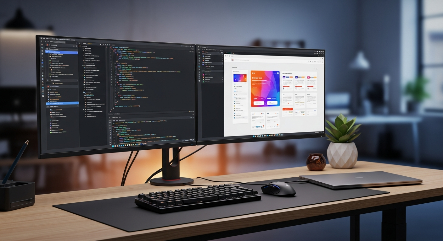
Claude Code로 shadcn/ui 활용하기: React 실전 가이드
Claude Code로 shadcn/ui를 도입하고 Button/Card/Form/Dialog/Table, 디자인 토큰, Playwright 검증까지 다룹니다.

shadcn/ui는 완성된 컴포넌트를 node_modules에서 불러오는 전통적인 UI 라이브러리가 아닙니다. CLI가 Button, Card, Dialog, Table 같은 컴포넌트 소스 코드를 프로젝트 안으로 복사하고, 팀은 그 코드를 직접 소유합니다. 그래서 Claude Code와 잘 맞습니다. Claude Code는 생성된 파일을 읽고, Tailwind class를 정리하고, React Hook Form을 연결하고, Playwright 테스트까지 추가할 수 있습니다.
하지만 자유도가 높은 만큼 위험도 있습니다. “관리 화면 하나 만들어줘”라고만 요청하면 비슷한 Button을 새로 만들거나, 오래된 Tailwind 설정을 붙이거나, Dialog의 접근성 구조를 지울 수 있습니다. 이 글은 Vite + React + TypeScript 프로젝트에서 shadcn/ui를 안전하게 도입하는 흐름을 정리합니다. Claude Code 기본 사용법은 Claude Code 시작 가이드를 먼저 참고하세요.
공식 문서부터 확인하기
작업 전 Claude Code에 최신 공식 문서를 기준으로 삼으라고 알려주는 것이 좋습니다. shadcn/ui의 Vite 문서는 shadcn@latest를 사용하고, Tailwind CSS v4는 @theme 기반의 테마 변수를 설명합니다. Dialog의 동작은 Radix UI Primitives가 담당하며, Playwright는 toHaveScreenshot()으로 시각적 회귀를 확인합니다.
- shadcn/ui Vite installation
- shadcn/ui React Hook Form guide
- Tailwind CSS theme variables
- Radix UI Dialog docs
- Claude Code quickstart
- Playwright visual comparisons
flowchart LR
  A["Claude Code가 기존 구조를 읽음"] --> B["shadcn/ui init 실행"]
  B --> C["기본 컴포넌트 추가"]
  C --> D["디자인 토큰 정리"]
  D --> E["앱 전용 컴포넌트 작성"]
  E --> F["Playwright로 화면 고정"]
설치와 초기화
예시는 Vite로 진행합니다. Next.js에서도 같은 원칙을 쓸 수 있지만, 처음에는 라우팅과 Server Components까지 함께 다루지 않는 편이 이해하기 쉽습니다.
pnpm create vite@latest shadcn-claude-demo -- --template react-ts
cd shadcn-claude-demo
pnpm install
pnpm add tailwindcss @tailwindcss/vite
pnpm add -D @types/node
vite.config.ts에는 Tailwind 플러그인과 @ alias를 설정합니다. shadcn/ui가 생성하는 코드는 @/components/ui/button 형태의 import를 사용하므로 Vite와 TypeScript 설정이 맞아야 합니다.
import path from "node:path"
import react from "@vitejs/plugin-react"
import tailwindcss from "@tailwindcss/vite"
import { defineConfig } from "vite"

export default defineConfig({
  plugins: [react(), tailwindcss()],
  resolve: {
    alias: {
      "@": path.resolve(__dirname, "./src"),
    },
  },
})
{
  "compilerOptions": {
    "baseUrl": ".",
    "paths": {
      "@/*": ["./src/*"]
    }
  }
}
Claude Code에는 먼저 점검을 요청합니다.
이 Vite + React + TypeScript 프로젝트에 shadcn/ui를 도입하려고 합니다.
먼저 package.json, vite.config.ts, tsconfig*.json, src/index.css를 읽고
빠진 설정만 보고해 주세요. 제가 승인한 뒤에 shadcn@latest init과
필요 컴포넌트 추가를 진행해 주세요.
승인 후 명령을 실행합니다.
pnpm dlx shadcn@latest init
pnpm dlx shadcn@latest add button card field input label dialog table
pnpm add react-hook-form zod @hookform/resolvers
현재 shadcn/ui의 폼 가이드는 React Hook Form, Zod, Field 컴포넌트를 중심으로 합니다. 오래된 블로그에서 본 Form 예제를 그대로 붙이지 말고 공식 문서와 프로젝트 버전을 먼저 맞춥니다.
Button과 Card부터 작게 만들기
처음부터 대시보드 전체를 생성하지 말고, Button과 Card만 사용하는 작은 컴포넌트를 먼저 만듭니다. shadcn/ui가 만든 파일은 src/components/ui에 두고, 제품별 UI는 src/components/app에 둡니다.
import { Button } from "@/components/ui/button"
import {
  Card,
  CardContent,
  CardDescription,
  CardFooter,
  CardHeader,
  CardTitle,
} from "@/components/ui/card"

type ProjectSummaryCardProps = {
  name: string
  openIssues: number
  onCreateTask: () => void
}

export function ProjectSummaryCard({
  name,
  openIssues,
  onCreateTask,
}: ProjectSummaryCardProps) {
  return (
    <Card className="max-w-md">
      <CardHeader>
        <CardTitle>{name}</CardTitle>
        <CardDescription>
          Review open UI issues before starting the next task.
        </CardDescription>
      </CardHeader>
      <CardContent>
        <p className="text-3xl font-semibold">{openIssues}</p>
        <p className="text-muted-foreground text-sm">open issues</p>
      </CardContent>
      <CardFooter>
        <Button onClick={onCreateTask}>Add task</Button>
      </CardFooter>
    </Card>
  )
}
리뷰 요청은 파일 범위를 좁힙니다.
src/components/app/ProjectSummaryCard.tsx만 리뷰해 주세요.
props 타입, shadcn/ui import, Tailwind class 가독성, 접근성을 확인해 주세요.
다른 파일 수정 제안은 꼭 필요한 경우에만 이유와 함께 적어 주세요.
Form은 Field, React Hook Form, Zod로 구성하기
폼은 겉보기보다 복잡합니다. 실제 서비스에서는 검증, 오류 메시지, aria-invalid, 제출 중 버튼 비활성화, 자동 완성 속성, 서버 오류 처리가 필요합니다.
"use client"

import { zodResolver } from "@hookform/resolvers/zod"
import { Controller, useForm } from "react-hook-form"
import * as z from "zod"

import { Button } from "@/components/ui/button"
import {
  Field,
  FieldDescription,
  FieldError,
  FieldGroup,
  FieldLabel,
} from "@/components/ui/field"
import { Input } from "@/components/ui/input"

const contactSchema = z.object({
  email: z.string().email("Enter a valid email address"),
  topic: z.string().min(4, "Use at least 4 characters"),
})

type ContactFormValues = z.infer<typeof contactSchema>

export function ContactForm() {
  const form = useForm<ContactFormValues>({
    resolver: zodResolver(contactSchema),
    defaultValues: {
      email: "",
      topic: "",
    },
  })

  function onSubmit(values: ContactFormValues) {
    console.log("submit", values)
  }

  return (
    <form className="max-w-md space-y-4" onSubmit={form.handleSubmit(onSubmit)}>
      <FieldGroup>
        <Controller
          name="email"
          control={form.control}
          render={({ field, fieldState }) => (
            <Field data-invalid={fieldState.invalid}>
              <FieldLabel htmlFor={field.name}>Email</FieldLabel>
              <Input
                {...field}
                id={field.name}
                type="email"
                aria-invalid={fieldState.invalid}
                autoComplete="email"
              />
              <FieldDescription>We will use this address to reply.</FieldDescription>
              {fieldState.invalid && <FieldError errors={[fieldState.error]} />}
            </Field>
          )}
        />
      </FieldGroup>

      <Button type="submit" disabled={form.formState.isSubmitting}>
        Send
      </Button>
    </form>
  )
}
작은 폼은 schema와 컴포넌트를 한 파일에 둬도 괜찮습니다. 필드가 늘어나면 schema.ts, ContactForm.tsx, 서버 action을 의도적으로 분리하도록 Claude Code에 요청합니다.
Dialog와 Table을 안전하게 연결하기
Dialog는 단순한 팝업이 아닙니다. Radix UI Dialog는 모달 모드, 포커스 트랩, Escape 닫기, Title/Description을 통한 스크린 리더 알림을 처리합니다. shadcn/ui는 여기에 스타일을 얹으므로 구조를 지우면 안 됩니다.
import { useState } from "react"

import { Button } from "@/components/ui/button"
import {
  Dialog,
  DialogContent,
  DialogDescription,
  DialogFooter,
  DialogHeader,
  DialogTitle,
} from "@/components/ui/dialog"
import {
  Table,
  TableBody,
  TableCell,
  TableHead,
  TableHeader,
  TableRow,
} from "@/components/ui/table"

type Customer = {
  id: string
  name: string
  plan: "Free" | "Pro" | "Team"
}

const customers: Customer[] = [
  { id: "cus_001", name: "Aoi Tanaka", plan: "Pro" },
  { id: "cus_002", name: "Mika Sato", plan: "Team" },
]

export function CustomerTable() {
  const [selectedCustomer, setSelectedCustomer] = useState<Customer | null>(null)

  return (
    <>
      <Table>
        <TableHeader>
          <TableRow>
            <TableHead>Customer</TableHead>
            <TableHead>Plan</TableHead>
            <TableHead className="text-right">Actions</TableHead>
          </TableRow>
        </TableHeader>
        <TableBody>
          {customers.map((customer) => (
            <TableRow key={customer.id}>
              <TableCell className="font-medium">{customer.name}</TableCell>
              <TableCell>{customer.plan}</TableCell>
              <TableCell className="text-right">
                <Button
                  variant="outline"
                  size="sm"
                  onClick={() => setSelectedCustomer(customer)}
                >
                  Edit
                </Button>
              </TableCell>
            </TableRow>
          ))}
        </TableBody>
      </Table>

      <Dialog open={selectedCustomer !== null} onOpenChange={() => setSelectedCustomer(null)}>
        <DialogContent>
          <DialogHeader>
            <DialogTitle>Edit customer</DialogTitle>
            <DialogDescription>
              Review the contract plan for {selectedCustomer?.name}.
            </DialogDescription>
          </DialogHeader>
          <DialogFooter>
            <Button variant="outline" onClick={() => setSelectedCustomer(null)}>
              Close
            </Button>
          </DialogFooter>
        </DialogContent>
      </Dialog>
    </>
  )
}
API 연결은 페이지 계층에 두고, Table에는 customers와 onEdit만 전달하는 방식이 리뷰하기 쉽습니다. Claude Code가 UI 수정 중 데이터 계층까지 만지는 일을 줄일 수 있습니다.
디자인 토큰과 Tailwind 설정 정리
디자인 토큰은 색, 여백, 둥근 모서리, 그림자, 폰트 같은 시각적 값을 이름으로 관리하는 방식입니다. Tailwind v4에서는 @theme이 유틸리티 생성을 좌우하고, shadcn/ui 컴포넌트는 --background, --primary, --border 같은 CSS 변수를 사용합니다.
@import "tailwindcss";

@theme {
  --font-sans: Inter, system-ui, sans-serif;
  --radius-card: 0.75rem;
  --color-brand-500: oklch(0.62 0.18 250);
}

:root {
  --radius: 0.625rem;
  --background: oklch(1 0 0);
  --foreground: oklch(0.145 0 0);
  --primary: oklch(0.205 0 0);
  --primary-foreground: oklch(0.985 0 0);
  --border: oklch(0.922 0 0);
  --input: oklch(0.922 0 0);
  --ring: oklch(0.708 0 0);
}

.dark {
  --background: oklch(0.145 0 0);
  --foreground: oklch(0.985 0 0);
  --primary: oklch(0.922 0 0);
  --primary-foreground: oklch(0.205 0 0);
  --border: oklch(1 0 0 / 10%);
  --input: oklch(1 0 0 / 15%);
  --ring: oklch(0.556 0 0);
}
Tailwind v3 프로젝트라면 “v4로 이전하는 계획”과 “v3 유지 최소 수정”을 분리해서 받으세요. 두 방식을 섞으면 원인을 찾기 어려운 스타일 문제가 생깁니다.
복사 붙여넣기 드리프트 막기
shadcn/ui의 장점은 코드를 소유한다는 점이고, 단점도 코드를 소유한다는 점입니다. 규칙이 없으면 비슷한 Button과 Card가 계속 늘어납니다.
| 규칙 | 이유 |
|---|---|
src/components/ui는 shadcn/ui 기반 컴포넌트만 둔다 | 생성 코드와 커스텀 차이를 추적하기 쉽다 |
제품 전용 UI는 src/components/app에 둔다 | 비즈니스 로직이 기반 컴포넌트로 새지 않는다 |
components.json alias를 함부로 바꾸지 않는다 | import 경로 혼란을 막는다 |
| Claude Code에 대상 파일을 명확히 준다 | 중복 컴포넌트를 줄인다 |
src/components/ui는 shadcn/ui에서 온 컴포넌트입니다.
새 Button이나 Card를 만들지 말고 기존 import를 사용해 주세요.
제품 전용 UI는 src/components/app에 작성해 주세요.
수정 후 rg "function .*Button|export .*Button" src/components를 실행하고
중복이 생겼는지 보고해 주세요.
git diff -- src/components/ui
git diff -- src/components/app
pnpm lint
pnpm build
작업 흐름을 더 단단히 만들고 싶다면 Claude Code 생산성 팁도 함께 보세요.
Playwright로 시각적 회귀 확인
Playwright의 시각 비교는 기준 이미지를 만들고 다음 실행에서 차이를 비교합니다. OS, 브라우저, 폰트, viewport가 다르면 차이가 생길 수 있으므로 CI와 같은 환경에서 기준 이미지를 만드는 것이 좋습니다.
pnpm create playwright
pnpm playwright install
pnpm dev
pnpm playwright test
import { expect, test } from "@playwright/test"

test("customer table dialog visual state", async ({ page }) => {
  await page.goto("/customers")
  await page.getByRole("button", { name: "Edit" }).first().click()

  await expect(page).toHaveScreenshot("customers-dialog.png", {
    maxDiffPixels: 120,
  })
})
의도한 디자인 변경일 때만 스냅샷을 갱신합니다.
pnpm playwright test --update-snapshots
실패했을 때는 구체적인 화면 문제를 Claude Code에 전달합니다.
Playwright customers-dialog.png가 실패했습니다.
모바일에서 Dialog footer 버튼 간격이 너무 좁습니다.
src/components/app/CustomerTable.tsx와 관련 CSS만 읽고 수정해 주세요.
DialogTitle과 DialogDescription은 삭제하지 마세요.
세 가지 활용 사례
첫째, 새 관리 화면 구축입니다. Button, Card, Table, Dialog만 있어도 목록, 상세, 편집, 확인 흐름을 만들 수 있습니다. 정적 데이터 UI를 먼저 만들고 API 연결은 다음 단계로 나누는 것이 안전합니다.
둘째, 기존 제품의 UI 통일입니다. 전체 리디자인보다 검색 폼, 설정 Dialog, 빈 상태 Card처럼 경계가 분명한 부분부터 바꾸세요.
셋째, 유료 프로토타입이나 고객 데모입니다. mock 데이터는 허용하되 컴포넌트 경계는 실제 제품에 가깝게 유지하라고 요청하면 버리는 코드가 줄어듭니다.
접근성 개선에도 잘 맞습니다. label, 키보드 조작, Dialog 구조를 확인할 때는 Claude Code 접근성 실천법과 함께 보면 좋습니다.
흔한 실수
가장 흔한 실수는 Tailwind v4 프로젝트에 v3 설정 조각을 붙이는 것입니다. 먼저 설치 버전과 빌드 방식을 확인하세요.
두 번째는 components/ui에 제품 로직을 넣는 것입니다. 결제 플랜 전용 variant를 기본 Button에 넣으면 무관한 화면까지 영향을 받습니다.
세 번째는 DialogTitle을 삭제하는 것입니다. 화면에 보이기 싫다면 시각적으로 숨기는 방법을 검토하고, 구조 자체를 없애지 마세요.
네 번째는 HTML required만 믿는 것입니다. 실제 폼에는 번역된 오류, 비동기 검증, 서버 오류가 필요합니다.
다섯 번째는 Playwright 기준 이미지 환경을 고정하지 않는 것입니다. 폰트와 viewport 차이도 실패 원인이 됩니다.
바로 쓰는 프롬프트와 결과
목표: Vite + React + TypeScript 관리 화면에 shadcn/ui를 도입한다.
Button, Card, Field 기반 Form, Dialog, Table을 사용한다.

제약:
- 현재 공식 문서를 따른다
- src/components/ui는 shadcn/ui 기반 컴포넌트만 둔다
- 앱 전용 컴포넌트는 src/components/app에 둔다
- 폼은 React Hook Form + Zod + Field로 구현한다
- DialogTitle과 DialogDescription을 유지한다
- Tailwind v4 @theme와 CSS 변수 변경 이유를 설명한다
- Playwright toHaveScreenshot 테스트를 1개 추가한다

진행:
1. 기존 설정 읽기
2. 변경 계획 제안
3. 승인 후 구현
4. pnpm build와 pnpm playwright test 실행
5. 변경 파일과 위험 요약
이 흐름을 최소 Vite 앱에서 실제로 확인한 결과, 컴포넌트 설치, @theme 브랜드 색 추가, Field 기반 폼, Table 행에서 Dialog 열기, Playwright 스크린샷 테스트까지 이어서 재현할 수 있었습니다. 두 번째 수정이 필요했던 부분은 폼 오류 표시였고, aria-invalid와 FieldError를 명시하자 리뷰가 훨씬 쉬워졌습니다.
팀에서 반복 사용하려면 위 프롬프트를 CLAUDE.md에 넣으세요. ClaudeCodeLab은 이런 UI 구현 규칙, 리뷰 체크리스트, Claude Code 프롬프트를 유료 템플릿으로도 정리해 두었습니다. 매 sprint마다 같은 설명을 반복하는 팀이라면 충분히 비용을 줄일 수 있습니다.
무료 PDF: Claude Code 치트시트
이메일을 입력하면 명령, 리뷰 습관, 안전한 워크플로를 정리한 PDF를 받을 수 있습니다.
개인정보를 안전하게 관리하며 스팸을 보내지 않습니다.

작성자 소개
Masa
Claude Code 실무 워크플로와 팀 도입을 검증하는 엔지니어입니다.
관련 글
Obsidian 메모를 CLAUDE.md로 바꾸는 Claude Code 워크플로
Obsidian 작업 메모를 CLAUDE.md 운영 노트로 정리해 Claude Code 세션의 문맥 반복을 줄입니다.

Claude Code Revenue CTA Routing: 글에서 PDF, Gumroad, 상담으로 보내기
독자 의도에 따라 무료 PDF, Gumroad 상품, 상담으로 나누는 Claude Code CTA 설계입니다.

Claude Code 팀 인계 규칙: 리뷰 증거, 권한, 롤백, 수익 경로까지 넘기는 법
Claude Code 작업을 팀에 넘길 때 필요한 증거, 권한 규칙, 롤백, 무료 PDF, Gumroad, 상담 경로 체크리스트.